Creating an Interactive Bubble Chart
This tutorial uses Google spreadsheets to create an Interactive Bubble Chart. There is sample data for this tutorial here .
- Start with the World Bank dataset.
- Select all years and all countries (except the names that are definitely not countries: such as world, North America and son on).
- Copy the data to a new sheet.
- In order to do animated bubble plots you’ll need to order your columns so that is country names, B is year and the rest are values you’re interested in. The column order will affect the way the gadget is set up per default.

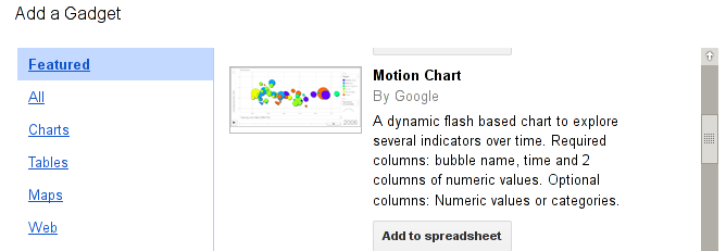
- Now mark the whole sheet and click “insert” “gadget”
- Select “charts” and “motion chart”.

- You’ll see the chart loading.
- You can adjust the values for each of the axis and the size. And you can slide through the years.
- Click on play and see how the world changes in 10 years.
- Improve this page Edit on Github Help and instructions
-
Donate
If you have found this useful and would like to support our work please consider making a small donation.
