Walkthrough: Scatterplot
This tutorial uses Google spreadsheets to create a scatterplot. There is sample data for this tutorial here .
So let’s create a scatterplot.
- Start with World Bank Data.
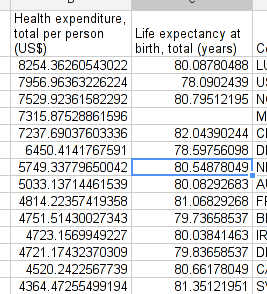
- Copy it to a new sheet and put the columns “healthcare expenditure total per person” and “life expectancy” next to each other.

- Click
insertcharts...and select “scatter plot” from charts. - Select the first one, since this is what we want to do.
- And there you go: simply adapt the scatterplot so it looks nice. Don’t forget to label axes. Try to make the dots smaller if there is significant overlap.
- Improve this page Edit on Github Help and instructions
-
Donate
If you have found this useful and would like to support our work please consider making a small donation.
